I started writing Wicked City in early 2012. My intent for years was to hire an artist to create a striking image (or images) I could use for the marketing of the book and to do the design myself. The design is the title text, blurb, all the stuff that goes over an image on a book cover.
Even though I’ve largely stepped away from art for the last few years, you can’t take the artist out of the guy, and for the entirety of work on the book, I’ve been thinking through what image would sell the tone and scope of the book the best.
Back at the beginning: 2012
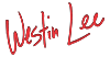
This is an image I created for a defunct website I was to post Wicked City to in parts. While a tad clumsy looking now, it captures the world of the book well. This was the first polished image I created that ‘felt’ like the city and the Kyries. Nod to Ado Ceric, the Lucas at the balcony in the lower right is taken from concept art he did for Wicked City in 2010, when it was still a feature film.
Next, fall 2012. The plan was to put Wicked City out in parts, like everyone wanted to do in the wake of Hugh Howey’s wildly popular WOOL.

It uses the cool cityscape from the above image, with some Trajan Pro text around it. The best critique of this one was ‘it looks like the cover of a Christian fiction novel.’ It does, doesn’t it? Not my finest work, but you can see a couple of ideas starting to form.
It bears mentioning: when I was writing this first draft in 2012, I did not know what the book was actually about, and as such, I had no way to pitch the tone to someone in an effective way. All that I really had was ‘well, the setting is this cool rusted city ruled by scientists’ and thus all there is is the setting.
We flash forward a year! 2013


It wasn’t until sometime in early 2013, as I began work on the next draft, that I caught the theme at the core of the book.
I made all of these while living in Berlin, and look at the colors and the ‘roughness’ of them! These pop while still sticking to secondary colors – purples, pinks, oranges. They are impactful, with drama and movement to them.
The hands in the middle piece are Acsey’s (bottom) and Lucas’ (top) and the idea was each are being pulled back by respective elements from their story. This is also the first example of using the cover to pitch the dual main characters in the novel. It is also the first design rough that juxtaposes the city and the Kyries – Acsey is framed on either side by the city with the sky behind her arm, creating a claustrophobic feel, while Lucas’s arm is directly over a Kyrie and framed by sunset sky, giving a sort of open air, falling panic to it.
If you’ve read the book, these are very much parts of each character’s respective story. Some of that was conscious, I remember, but a lot of that was just repeatedly coming back to this work and giving it another go.
September 2014
I was finishing work on a beta read (thank you beta readers!!) and something inspired me to come back to the designs.


Here I had hit on the concept of a fashion show runway juxtaposed with the city. Why not someone who looks like a model, but they’re walking through a Kowloon-esque alley? Why not put a Kyrie in there?
Note this is the first time I hit on using a monospace font for the title. It felt right. Also, note the itty bitty line of Kyrie soldiers in the middle rough – standing guard like a wall, protecting the Kyrie from the city closing in around them.
2015
I had seen a picture of a model somewhere that struck me as particularly interesting.


I still really like the textured helmet in this one. You can’t tell what it is in the design but I was struck by the contrast between this beautiful woman and the gritty wear on both the helmet and the graffiti-esque title design.
Now that I see it again, I think I like this title art a LOT.
This is one of the first designs where I openly asked people ‘what is this book about?’ and the hard truths about what I thought looked cool and what it implied came a rollin’ in. This rough was a pass in the end because it called to mind skilled lady assassins, and that’s not quite the book.
Okay next batch. These are from mid-2015, and like with the last helmet design, I solicited feedback.
What are these books about?


I love the 1970’s-styled middle design, and I thought I had solved the helmet issue from the previous close-up by pulling back, but the helmet sort of looks like a severed robot head. Or a ham.
The design on the right is a fun one. The truth is, I didn’t feel like my art skills were up to doing this design, and I wasn’t interested in going out and putting together a photo shoot.
The design on the left was one of the first where people regularly guessed what the story was about, and then kept asking questions after they found out they were right. I had wanted to do something more dynamic for the cover, but if this was the most effective way to pitch the book, then I had a concept to work from.
Getting Warmer
With that feedback in mind around then I did a series of roughs to see if I could hit that ‘us and them’ ‘culture and chaos’ visual from another angle.


Of the bunch I’m most fond of the first one. It has depth and gives us a pretty good look at the city, but having a wall of city on either side really brings out the sort of pressed-in fear the Kyries have. It makes them feel trapped, even though their towers look remarkable and imposing.
A Winner
Work on the final design began in mid-2016…


And you can see I had a plan to try and get a person back onto the cover. I have several sketches and mockups where a monochromatic Acsey stands, head tilted back, in front of Kyrie Kessler. The inspiration for her look was to be the cover of Melissa Auf Der Mar’s album Out of Our Minds. Doesn’t she look cool?
Buuuut, as work continued, the details and complexity fo the city and the Kyrie meant that keeping Acsey in would have made the cover extraordinarily busy. And the early response to this design and color scheme was very strong, so instead I worked on developing it.


There were a half-dozen other titling options I tried, but this is the one that stood out the most. The monospace font stucl – I think it hits the tone of the book while also implying a world where a dot matrix printer would be a remarkble thing.
On the subject of font selection, there were two genre types I intentionally wanted to avoid that a font could easily evoke – Victorian and Art Deco. Both settings are heavily used as visual and tone reference in the type of sci-fi dystopian genre Wicked City lives in, and both are absolutely wrong for Wicked City.
Victorian imagery is used heavily in steampunk, and steampunk revels in de-make style technology, like Wicked City does, but Wicked City is a world where technology is ramshackle and cannot be trusted. Steampunk also has a swashbuckling thing to it, and I don’t care for how safe swashbuckling characters are, what with their ability to effortlessly do crazy things. I want a world where you can’t rely on your heroes to get it right, so that if they do, it’s all the more remarkable.
Art Deco, of course, evokes New York in the 1920s and 30s, and is too hopeful and clean. It’s antiquated and feels too much like our world. You already know how an art deco story ends and what the rules of that world are.
The Final Design

Note I changed the blurb slightly – “A Dystopian Epic for Dreamers and Liars.” I went back and forth on whether to use the word epic, and ultimately I think we see enough of this world that it counts as an epic story. The “dreamers and liars” bit is there to tell the potential audience that this is a story about human arrogance and frailty. Theoretically, dreamers and liars sits on top of the contrast between the city and the pristine Kyrie behind it, and the idea ‘pretty lies hide ugly truths’ seeps in through osmosis.
Those elements I think sell Wicked City to the audience that would (hopefully) dig the story.
Now that this particular design is done I already have an itch to revise it, and maybe for the print layout I will make changes. Or maybe when one wears multiple hats self-publishing, they should leave well enough alone and get to the next book?